ODD LOBBY -
Brand Development
ODD LOBBY
Odd Lobby is a creative house where artists come to create, collaborate, and grow. From music production and recording to content creation for artist.
FROM LOGO TO BRAND
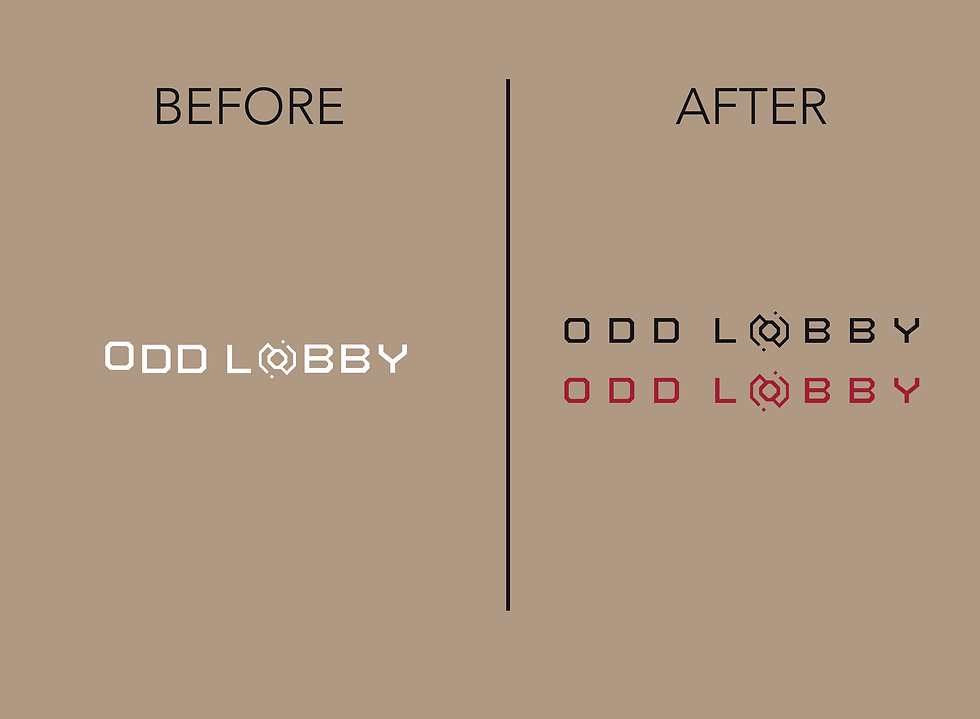
While the original logo was provided, I refined its balance and expanded it into a complete visual identity. I developed the brand strategy, color palette, and design system for Odd Lobby, creating a cohesive identity that reflects the studio's bold, artist-driven approach across both digital and print applications.


PROJECT MISSION
The goal was to develop a complete brand identity that resonated with Los Angeles' diverse creative community, from singers and songwriters to producers and more. The brand needed to feel bold, modern, and collaborative.
PROJECT TASKS
I was brought on by a good friend as a graphic designer, but my role quickly grew into Creative Director and Marketing Lead. From branding and marketing to the website, social media, and print materials. I had the opportunity to help shape Odd Lobby from the ground up.


Project Summary – ODD LOBBY Studio
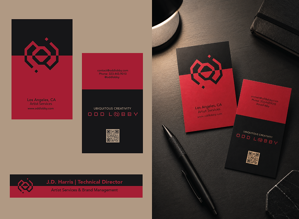
After conducting market research on creative studios, recording spaces, and artist communities in Los Angeles, I developed a visual identity that feels bold, minimal, and slightly mysterious. Many competing studios relied on loud visuals or corporate branding that risked overshadowing the artists themselves. Odd Lobby needed to feel different, a space where creatives could take center stage. The visual identity was intentionally kept clean and in black and white, allowing the artists and their work to remain the focus. I refined the existing logo, developed the brand color palette, and created a cohesive visual system centered around contrast, geometric shapes, and intentional use of negative space. The muted black, deep red, and warm cream palette creates a sense of confidence and intrigue while remaining approachable and timeless.
The goal was to create a brand that resonated with Los Angeles' diverse creative community, from singers and songwriters to producers, podcasters, and emerging artists. Odd Lobby needed to feel professional without losing its edge, minimal without feeling cold, and mysterious enough to spark curiosity while still inviting collaboration.
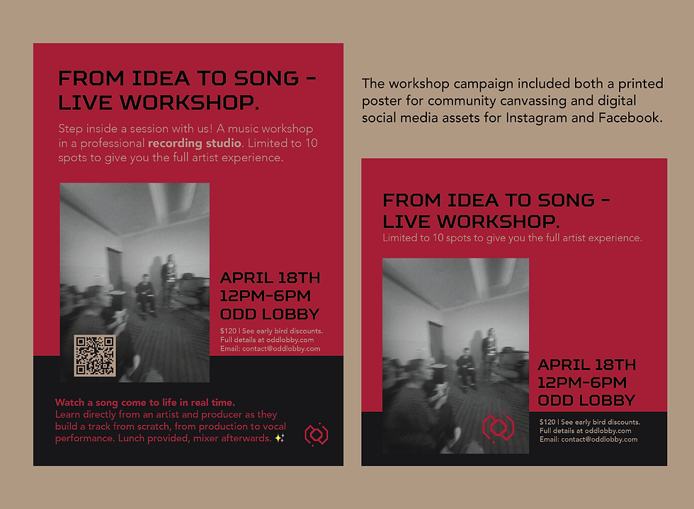
This project was especially meaningful because my role expanded far beyond graphic design. I served as the in-house Creative Director, Content Creator (all original content), Website Developer, and Marketing Lead. From the visual identity and website to social media campaigns, posters, postcards, business cards, and promotional materials, I helped shape Odd Lobby into a cohesive brand experience designed to support artists at every stage of their creative journey.
A full brand identity, website, social media presence, and extensive print collateral were developed under my direction, creating a consistent visual language across both digital and physical touchpoints.


ZEN HEALING -
Brand Revamp
ZEN HEALING
Zen Healing Retreat is a post-operative luxury care center in Los Angeles, CA. Zen provides a serene and restful environment for healing after surgery.
FROM LOGO TO BRAND
I was given a very low resolution logo to work with. I gave the logo a revamp and from there I developed a full brand strategy and visual identity.

PROJECT MISSION
To create a strong, and memorable brand identity that will push brand awareness and growth past the current inner circle, and word of mouth clientele.
PROJECT TASKS
I was the graphic designer and creative lead on the project. I was the photographer/videographer during the photoshoots. The client had very limited content and so we needed to create it. I directed and edited the brand content.
Project Summary – Zen Healing Retreat
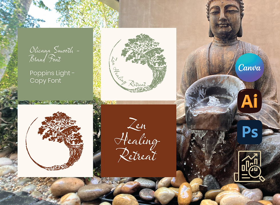
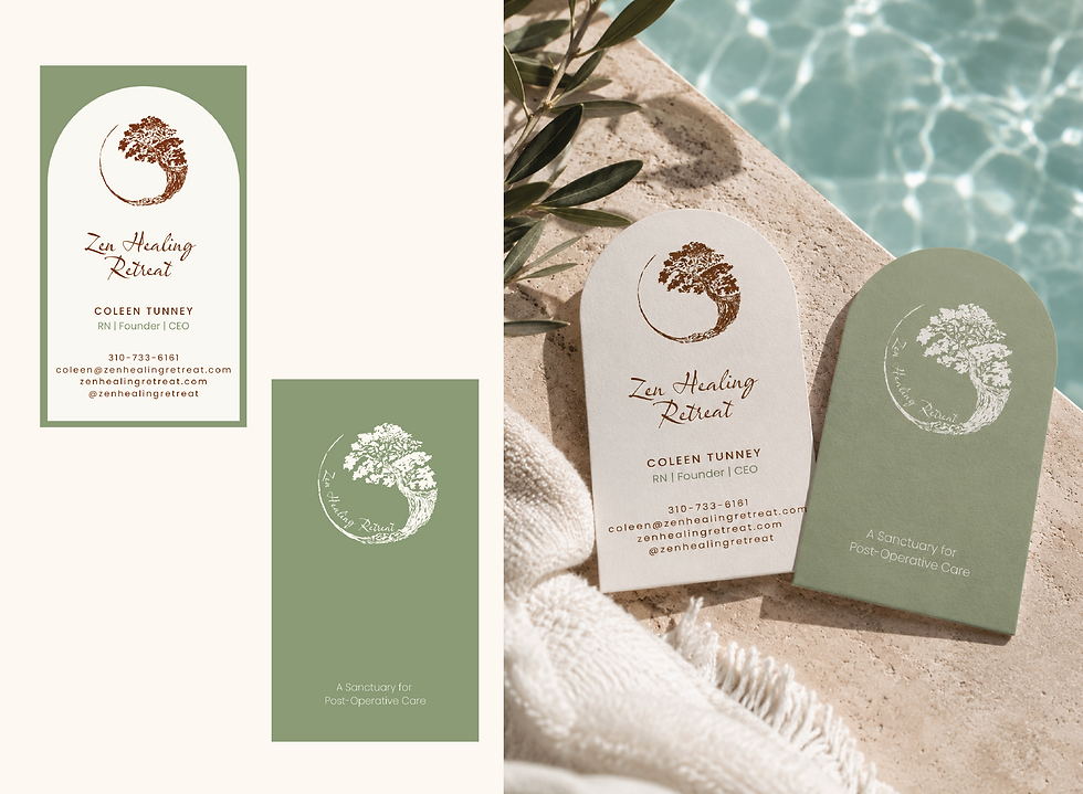
After conducting market research on healing retreats and competing brands, I developed a visual identity that feels organic, calming, and contemporary. Many of Zen Healing Retreat's competitors leaned heavily into clinical and corporate aesthetics, which did not align with the experience Zen wanted to provide. To create a cohesive identity, I incorporated the arch motif throughout the brand, paired with an organic circular shape inspired by the logo itself. These recurring elements add character and help establish a recognizable visual language. One example is the laser-cut arch on the booklet cover, and which creates depth and acts as a window into the brand experience, making the piece both tactile and memorable. The arch concept was carried throughout the brand, including the business cards, creating a cohesive and elevated visual experience that feels both elegant and inviting.
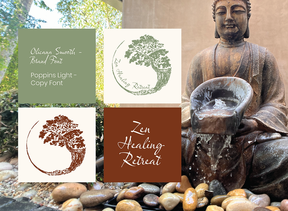
The color palette combines healing-inspired tones of sage, soft cream, and rust to evoke warmth, tranquility, and trust. I paired an expressive handwritten font with a modern sans serif to create balance, bringing warmth and personality while maintaining clarity and professionalism.
The brand needed to resonate with both patients seeking comfort and medical professionals or doctor's offices interested in future collaborations. The goal was to create an identity that feels serene yet modern, approachable yet sophisticated. I led the visual direction of the brand, from the logo, website, and printed materials to capturing original photography and video, ensuring every element reflected the peaceful atmosphere and human connection at the heart of Zen's healing retreat.
One design note: If I had been given a bit more creative freedom with the website, I would have opted for a more minimal approach, particularly on the "Services Page". The project manager and owner preferred a content-rich experience with extensive copy and strategically placed hyperlinks within the text, which can be very beneficial for SEO and improving search visibility. While I understand the direction, my personal design preference would have been to create more breathing room and allow the visuals to take on a larger role. That said, balancing aesthetics with business goals is an important part of the design process, and this project was a great example of finding that middle ground.



US HEALTH FAIRS - Brand Revamp
US HEALTH FAIRS
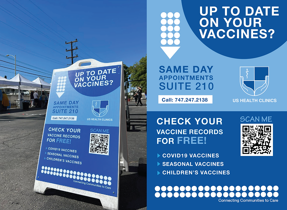
A nonprofit public health organization providing accessible health services to under-resourced communities throughout Southern California.
FROM LOGO TO BRAND
I was originally hired to refine the logo. The project quickly expanded into a full brand redesign, where I developed a cohesive visual identity across both print and digital.

PROJECT MISSION
Create a strong and memorable brand identity that increases awareness within both the healthcare community and the communities it serves.
PROJECT TASKS
My role extended beyond graphic design into creative direction and content production. I organized and led clinic photoshoots, captured both photography and video, and edited the final assets.
Project Summary - US Health Fairs
After researching healthcare organizations, community clinics, and nonprofit health initiatives, I developed a refreshed brand identity that feels modern, trustworthy, and approachable. Many organizations within the healthcare space rely on overly clinical visuals, which can unintentionally create a sense of distance. My goal was to create a brand that felt both professional and welcoming, reflecting the organization's commitment to connecting communities with quality healthcare.
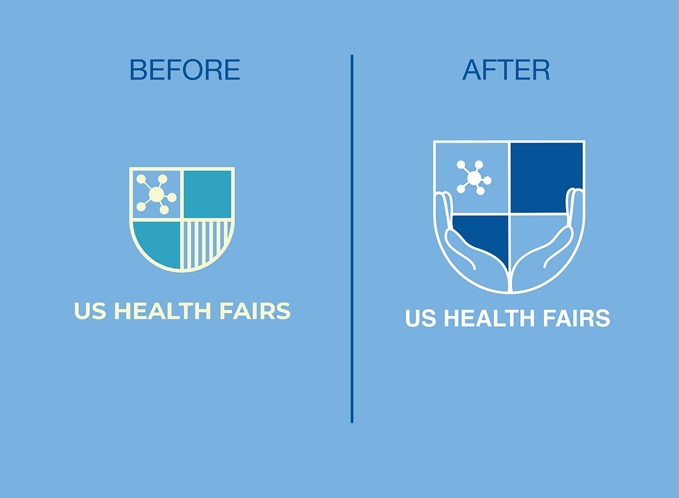
The project began with a logo redesign. The original mark felt dated and resembled a generic healthcare icon, lacking a strong sense of personality or human connection. I redesigned the logo to better represent the organization's mission by incorporating supportive hands surrounding the shield, symbolizing care, guidance, and community. The updated visual system was also expanded to support both US Health Fairs and US Health Clinics, creating consistency across the organization's growing services.
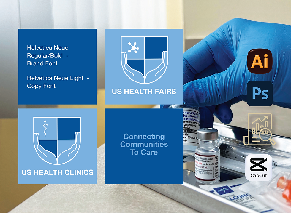
A clean color palette of deep blue, light blue, and white was selected to reinforce professionalism, trust, and accessibility while maintaining a welcoming presence. Helvetica Neue was chosen as the primary typeface for its clarity, timelessness, and excellent readability across both print and digital applications. Together, these elements create a cohesive identity that communicates credibility while remaining approachable for the diverse communities the organization serves.
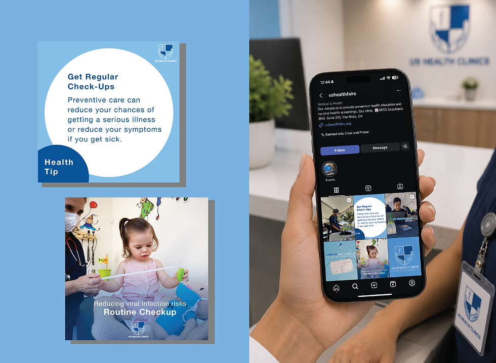
Beyond the visual identity, my role expanded into creative direction and content production. I organized and directed clinic photoshoots, captured photography and videography, and edited the final assets to build a comprehensive content library. With very limited existing brand content, I helped establish a consistent visual language across marketing materials, social media, print collateral, and the website.
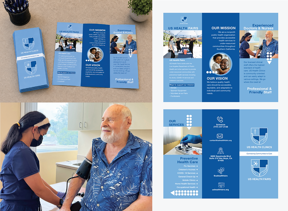
The final deliverables included a redesigned logo system, brand identity guidelines, brochures, business cards, marketing materials, photography, video content, and website assets. The result is a cohesive brand that strengthens recognition within the healthcare community while creating a more welcoming and trustworthy experience for patients seeking care.
https://www.ushealthfairs.org/
www.instagram.com/ushealthfairs/



Lille Barn -
Concept Brand
LILLE BARN
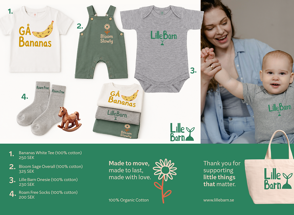
Lille Barn is a children's boutique concept brand inspired by Scandinavian design. The project was created to showcase a thoughtful, cohesive brand identity that feels playful, and inviting.
FROM LOGO TO BRAND
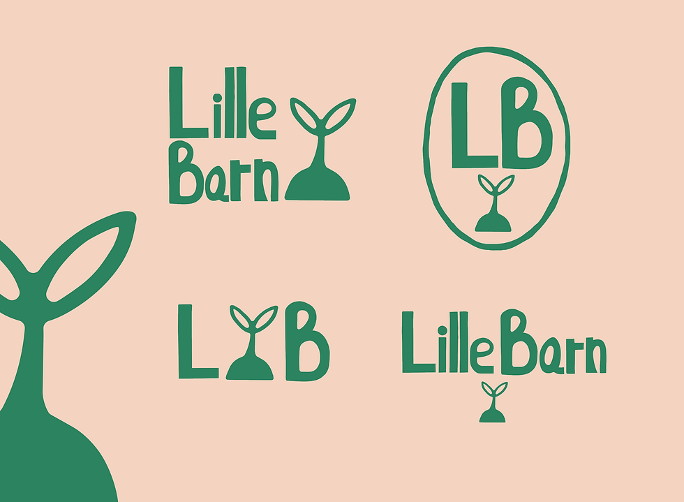
What started as a hand-drawn logo sketch in Procreate grew into a fully realized children's boutique brand identity.

PROJECT MISSION
To develop a realistic concept brand with a cohesive visual identity. Inspired by Scandinavian culture, the brand embraces nature, simplicity, and playful design.
PROJECT TASKS
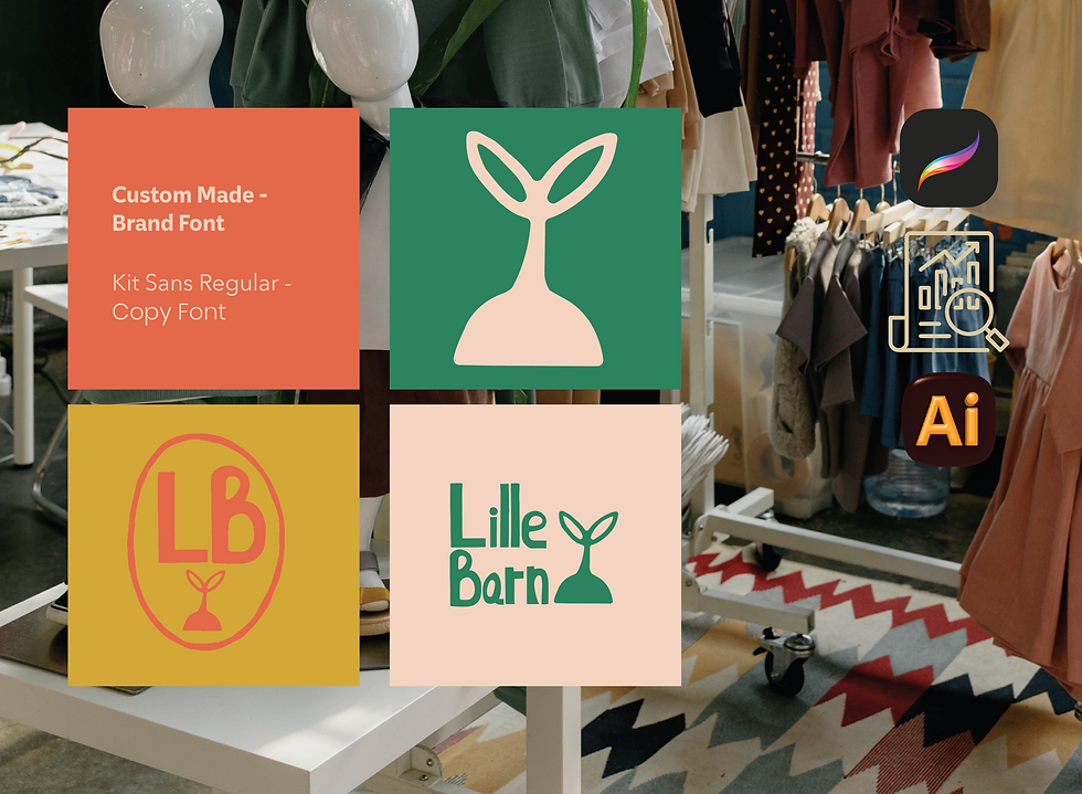
This project highlights my hand-drawn illustration skills. Every element of the logo, including the custom typography and seed icon, was created in Procreate and refined in Adobe Illustrator.
Project Summary – Lille Barn
Lille Barn began as a concept brand inspired by my Swedish upbringing and the Scandinavian philosophy of encouraging children to spend more time outdoors, embrace curiosity, and simply enjoy being kids. The goal was to create a children's boutique identity that felt playful, handcrafted, and authentic while remaining realistic enough to exist as a retail brand.
The identity started with a sketchbook and Procreate. Every element of the logo, including the custom hand-drawn typography and seed icon, was illustrated by hand before being refined and vectorized in Adobe Illustrator. The seed became the foundation of the visual identity, symbolizing growth, imagination, and childhood. It appears throughout the branding in different forms, creating a consistent visual language across both print and digital applications.
After researching Scandinavian children's brands and contemporary boutique retailers, I developed a visual identity that balances simplicity with personality. Rather than relying on loud, overly commercial graphics, the brand embraces organic shapes, playful illustrations, and approachable typography. The color palette combines earthy forest greens with warm terracotta tones, inspired by Nordic landscapes, wooden toys, and nature. These colors create a sense of warmth while remaining modern and memorable.
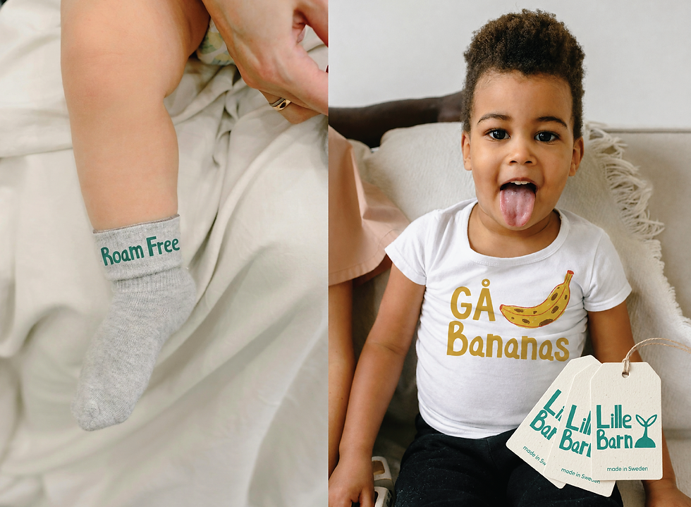
The brand extends beyond the logo into a complete identity system, including apparel graphics, stickers, storefront applications, social media content, and supporting brand elements. Playful messaging such as "Gå Bananas," "Bloom Slowly," and "Roam Free" reinforces the personality of the brand while encouraging imagination, exploration, and childhood independence.
Although Lille Barn is a concept project, it was approached as if it were a real client. Every design decision was made with scalability and consistency in mind, resulting in a cohesive brand that feels equally at home in a boutique storefront, across digital platforms, or on children's apparel and packaging.


Vagabond -
A Concept Brand
VAGABOND COFFEE
The concept blends rustic Texas charm with modern cafe culture, appealing to customers who want more then just coffee. They crave atmosphere identity.
CONCEPT BROUGHT TO LIFE
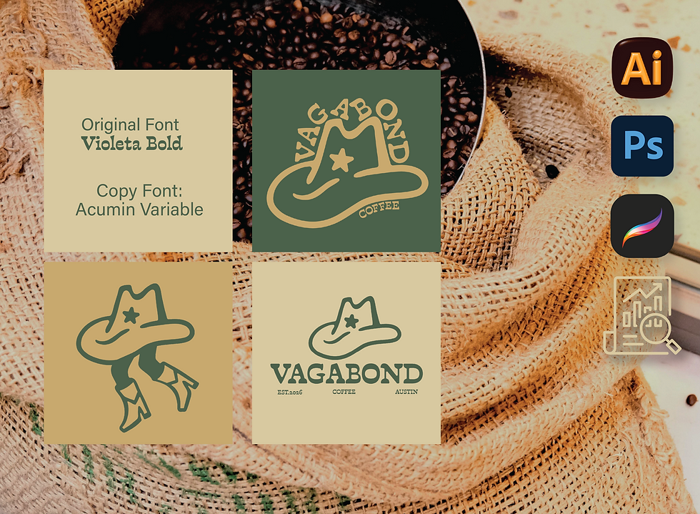
The idea began with a hand drawn sketch in Procreate that evolved into a full brand with potential.

PROJECT MISSION
Build Vagabond's brand identity from all angels so it feels like a real brand. From logo, to visuals and material such as menus, cups, fun stikcers etc.
PROJECT TASKS
Little bit of everything! From hand drawing the logo to converting it into a vector file in Adobe Illustrator and growing the brand.
Project Summary – Vagabond
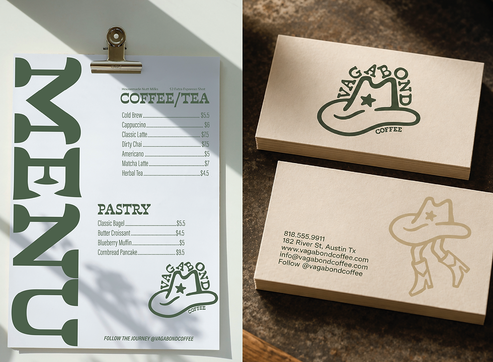
Vagabond Coffee is a fictional café concept inspired by Austin, Texas, blending rustic Western character with a modern neighborhood coffee shop. The identity combines handcrafted illustrations, earthy colors, and bold typography to create a brand that feels approachable, adventurous, and rooted in community.
The logo and supporting illustrations were originally hand-drawn in Procreate before being refined and converted into vector artwork in Adobe Illustrator, allowing the identity to remain authentic while being scalable across packaging, signage, merchandise, and digital applications.
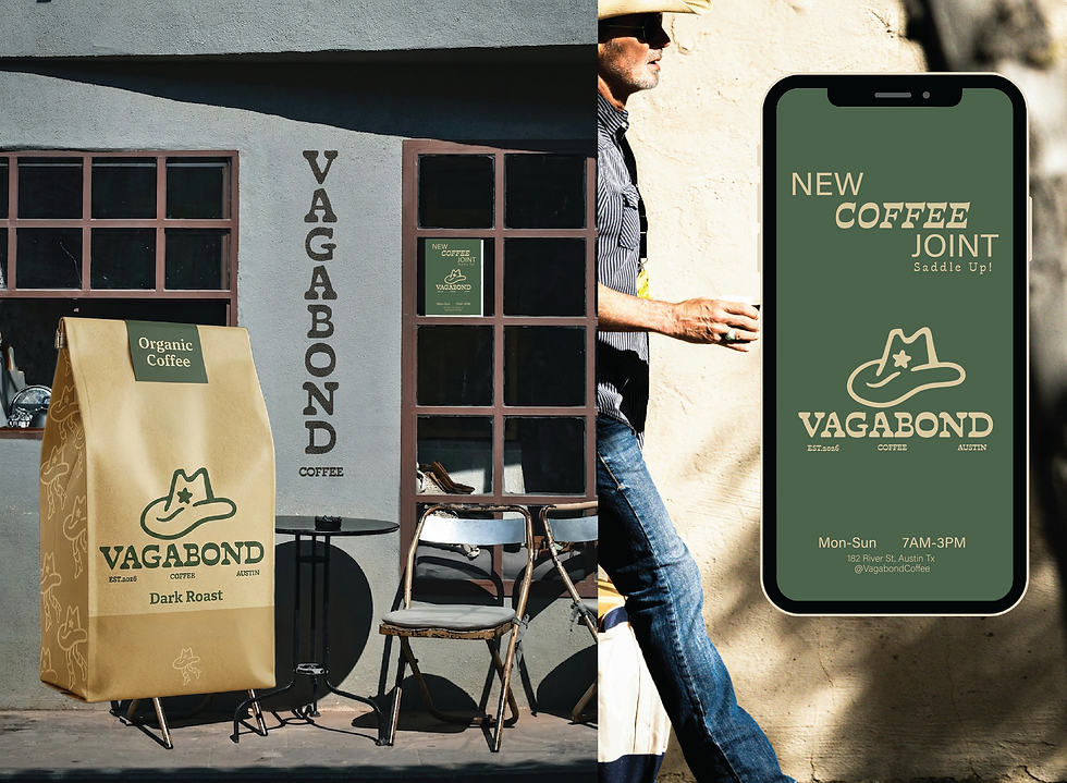
To demonstrate how the brand could live beyond the logo, I designed a collection of touchpoints including coffee packaging, café posters, menu concepts, environmental graphics, and social media advertising. Each application reinforces the brand's rustic personality while maintaining a clean, contemporary aesthetic.
The final identity balances Texas charm with modern café culture, creating a memorable visual system that feels equally at home on a coffee bag, storefront, or mobile campaign.


Harvest Roots -
Concept Brand
HARVEST ROOTS
Inspired by my frequent visits to Ojai, California, Harvest Roots is a concept farm-to-table restaurant centered around fresh, organic ingredients.
CONCEPT BROUGHT TO LIFE
The project started as a hand-drawn sketch after a day spent exploring Ojai. With the name locked in, I began developing the logo.

PROJECT MISSION
The goal was to demonstrate how a single visual concept can create a cohesive and recognizable brand experience rooted in sustainability and honest, simple design.
PROJECT TASKS
Once the logo was finalized and the custom typography refined, the rest of the brand identity naturally came together. Supporting visuals, and marketing materials were designed to create a cohesive farm-to-table experience.
Project Summary – Harvest Roots
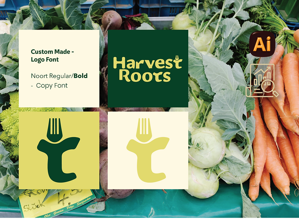
Harvest Roots is a farm-to-table brand concept inspired by the slow, intentional lifestyle of Ojai, California. The identity embraces fresh, locally sourced food through warm colors, organic shapes, and approachable typography that reflects the connection between people, farms, and community.
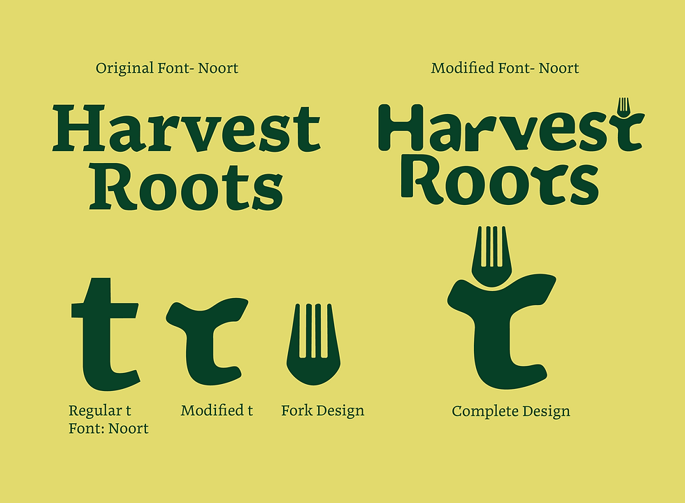
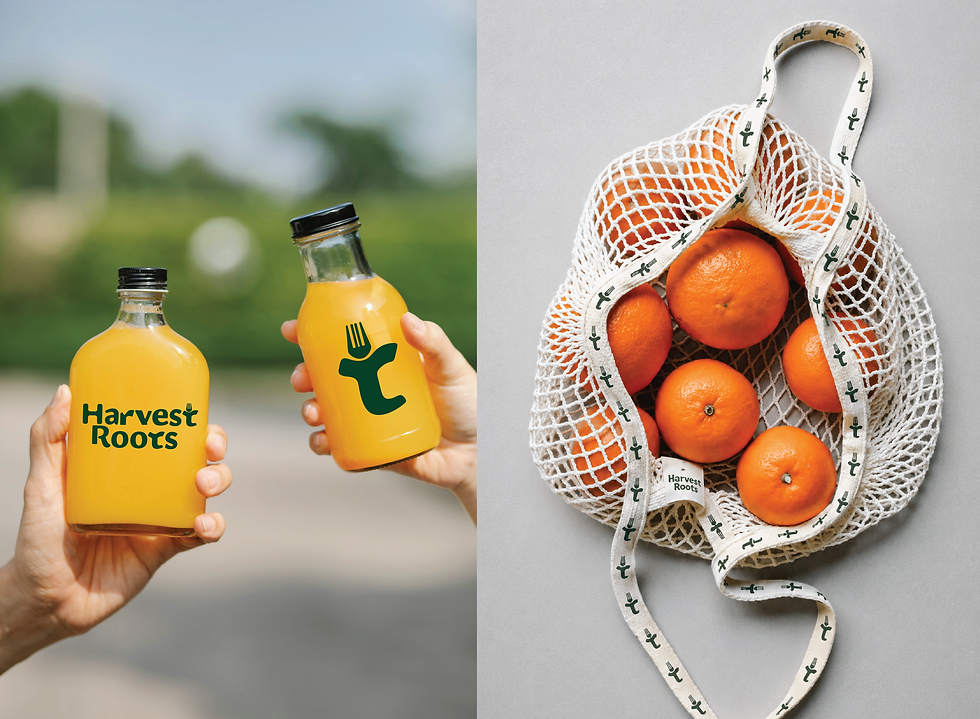
The branding began with the Noort typeface, which I customized to create a unique wordmark. I softened and rounded the letterforms to better reflect the brand's friendly personality, then transformed the "t" into a custom fork icon that became the foundation of the visual identity. This distinctive element carries throughout the branding, creating an instantly recognizable logo system.
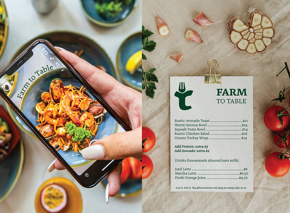
To showcase the versatility of the identity, I developed a series of brand applications including fresh juice packaging, market-inspired promotional materials such as the tote mesh bag, a simple yet beautiful menu. Every touchpoint reinforces Harvest Roots' commitment to fresh ingredients, sustainability, and simple, honest design.
The final brand captures the essence of Ojai's farm-to-table culture by blending handcrafted character with modern minimalism, resulting in a visual identity that feels wholesome, memorable, and inviting.

LOGOFOLIO - Concepts & Clients
LOGOFOLIO
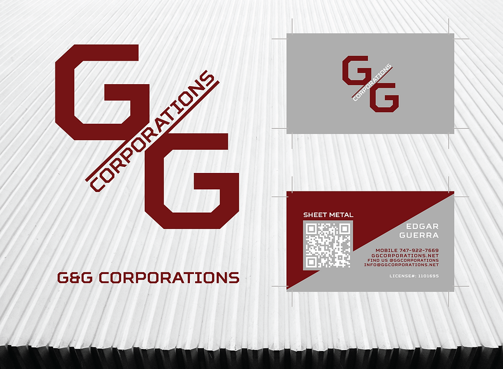
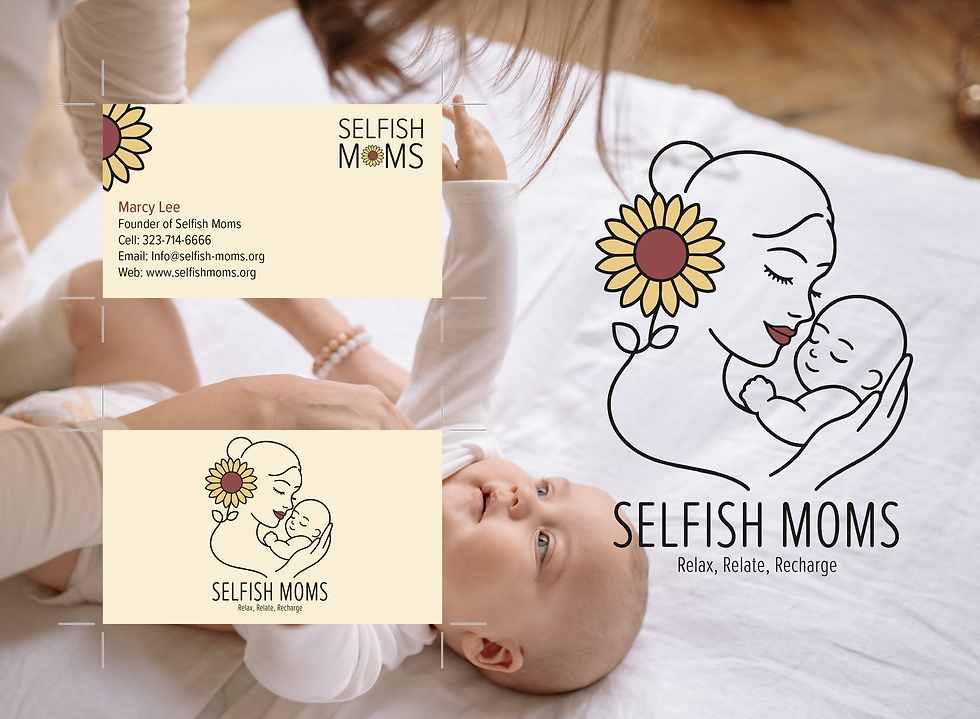
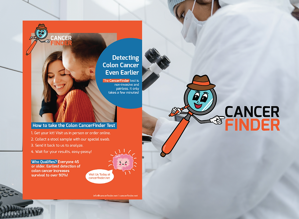
Additional logo concepts and selected client work. G&G Corporations, Selfish Moms, Cancer Finder are paid clients who received a complete brand package, including a custom logo, website, and business cards.
Transforming logos into complete brand experiences through market research and creative thinking.

PROJECT MISSION
Create memorable, timeless logos that tell a brand's story through thoughtful typography, symbolism, and visual identity.
PROJECT TASKS
Design original logo concepts and explore how they translate into cohesive branding systems across packaging, print, and digital media.